 Touch Screen Redesign
research, user testing, ux/ui design, illustration, prototype
sketch, illustrator, invision
After having the same product grid design on their machines for many years, Diji Touch was looking for a fresh redesign to entice more customers to use their machines. The interface was outdated and designed to imitate traditional vending machine layouts.
Bring a fresh look to the Diji Touch interface while showing all products on the grid.
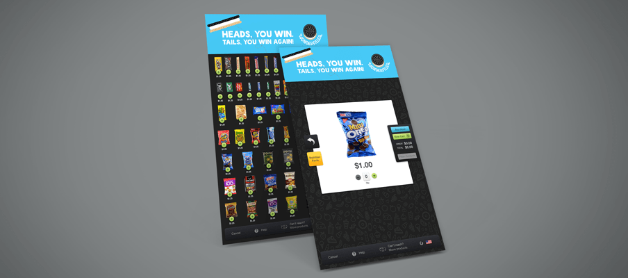
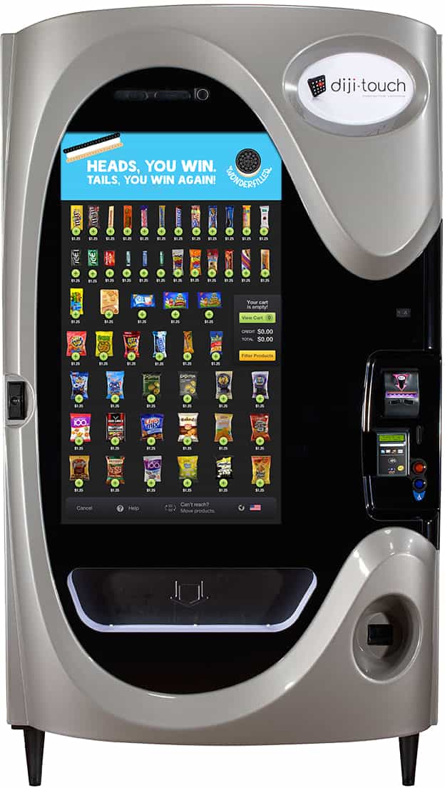
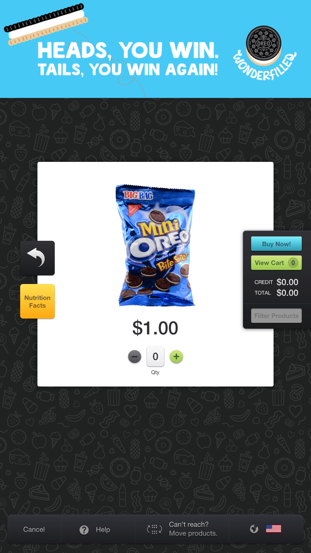
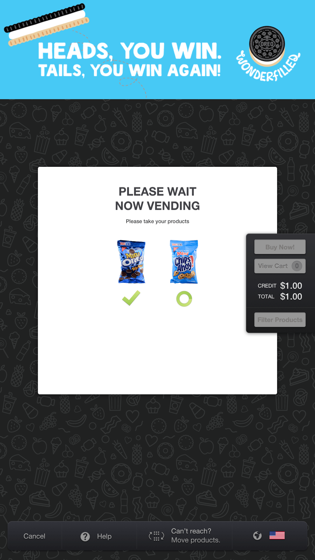
The main approach for this project was to take advantage of the technology in a touch screen vending machine. The original layout was designed to mimic a traditional vending machine which impedes the full potential of a touch screen device. One of the limitations that we needed to work around was the requirement to display all products in the machine at once, which could potentially be around 50 products in one machine at a time. Since this meant common touch screen interactions were not viable options, the first focus became the typography. Along with adding a quick-add feature, a filter option was also added as a way to quickly scan products on the grid. Other areas of the interface that were redesigned include the layout of the menu, the footer, the product detail layout, and the cart and vending screens.
Initial research for this project began with finding touch screen machines to interact with e.g. Redbox. Although the team had access to our own Diji Touch machine in the office, exploring other machines provided insight to concerns such as ADA accessibility and touch screen interactions that were already being used in the field. One of the many benefits of having access to a Diji Touch machine in the office was the ability to periodically conduct user testing as screens and designs were updated. The results pulled from these sessions influenced decisions made in the design and user flow of the machine. As the original layout was designed to mimic a traditional vending machine which impedes the full potential of a touch screen device.
One of the limitations that we needed to work around was the requirement to display all products in the machine at once, which could potentially be around 50 products in one machine at a time. Because of this, the main approach for this project was to take advantage of the technology in a touch screen vending machine. Since this also meant common touch screen interactions were not viable options, the first focus became the typography. Along with adding a quick-add feature, a filter option was also added as a way to quickly scan products on the grid. Other areas of the interface that were redesigned include the layout of the menu, the footer, the product detail layout, and the cart and vending screens. When the design portion was completed, I created an extensive InVision prototype (around 100 screens) to create a prototype for clients that required a seamless experience in order to approve the designs. Once everything was approved, I worked closely with our in-house developers to bring the new interface to life.


