 401kid Landing Page
research, ui design, illustration, copywriting
sketch, illustrator
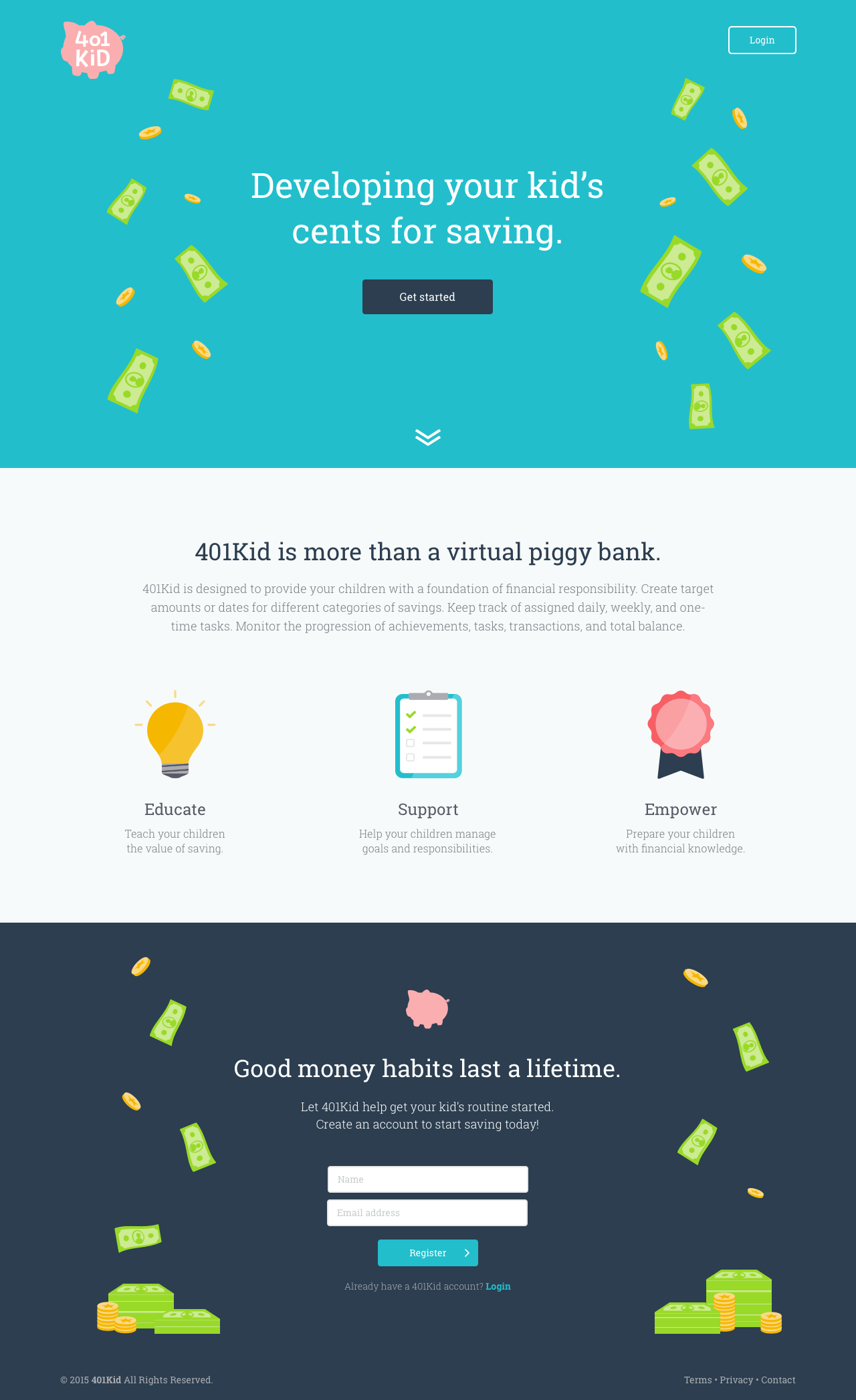
401Kid is an online learning tool used to teach kids about saving money. Although the dashboard had already been built, there was no landing or proper login page created for this product.
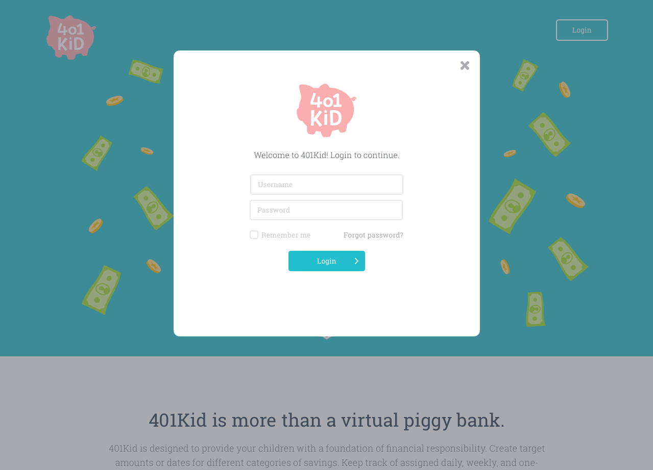
In addition to providing a login page for parents and children, a landing page was needed to inform parents on the abilities, purpose, and benefits of using 401Kid.
Apart from creating a simple but informative landing page, there was also a need to set a tone for the product itself. Copywriting is an essential part of creating the appropriate tone for a product and when paired with playful illustrations, the user experience is much more inviting.
I started my research with financial resources that were geared towards educating children and young adults. In hopes of eventually redesigning the internal dashboard, I used the color palette that had already been established from the internal dashboard in a more engaging way. By sticking with the existing brand but giving it a fresh update I was able to focus on the illustration and copywriting portions of this project. The challenge was to keep the illustrations light and fun, but playful enough that it would fit an age range of young child to young adult. Apart from having personal access to how the dashboard works, I had no other pre-written copy or sources to pull to help with copywriting. This took a lot of research into the aforementioned financial resources to help establish the right tone for this product that was informative to parents, but enticing enough for children to get involved. The final product was handed off as a Zeplin project for the developer to pull all the assets needed to build the landing page.

