 Checkout Redesign
The checkout redesign was necessary to improve user experience, purchase awareness, stimulate user trust, and increase over all conversions especially for customers coming from partner links/widget flows.
The main objective is to increase conversions on ParkWhiz and for our platform partners by providing the user with more detailed location information to educate their decision making process, decreasing visual clutter, deemphasizing the time picker flow to limit users interacting with it, while avoiding potential errors and issues with availability. The project success will be measured by means of live a/b testing to track user engagement, conversion, and circumstantial cancelation rate impact.
To evaluate and gather the scope of the redesign, we begun by conducting user tests to define immediate user pain points, as well as review the list of bugs and feature requests submitted by various team members. One of the high impact bugs was obstructing users from reviewing their destination, selected time, personal information by auto-scrolling directly to the payment details section. This bug was a quick fix with a high impact pay off, quickly implemented by the web development team.
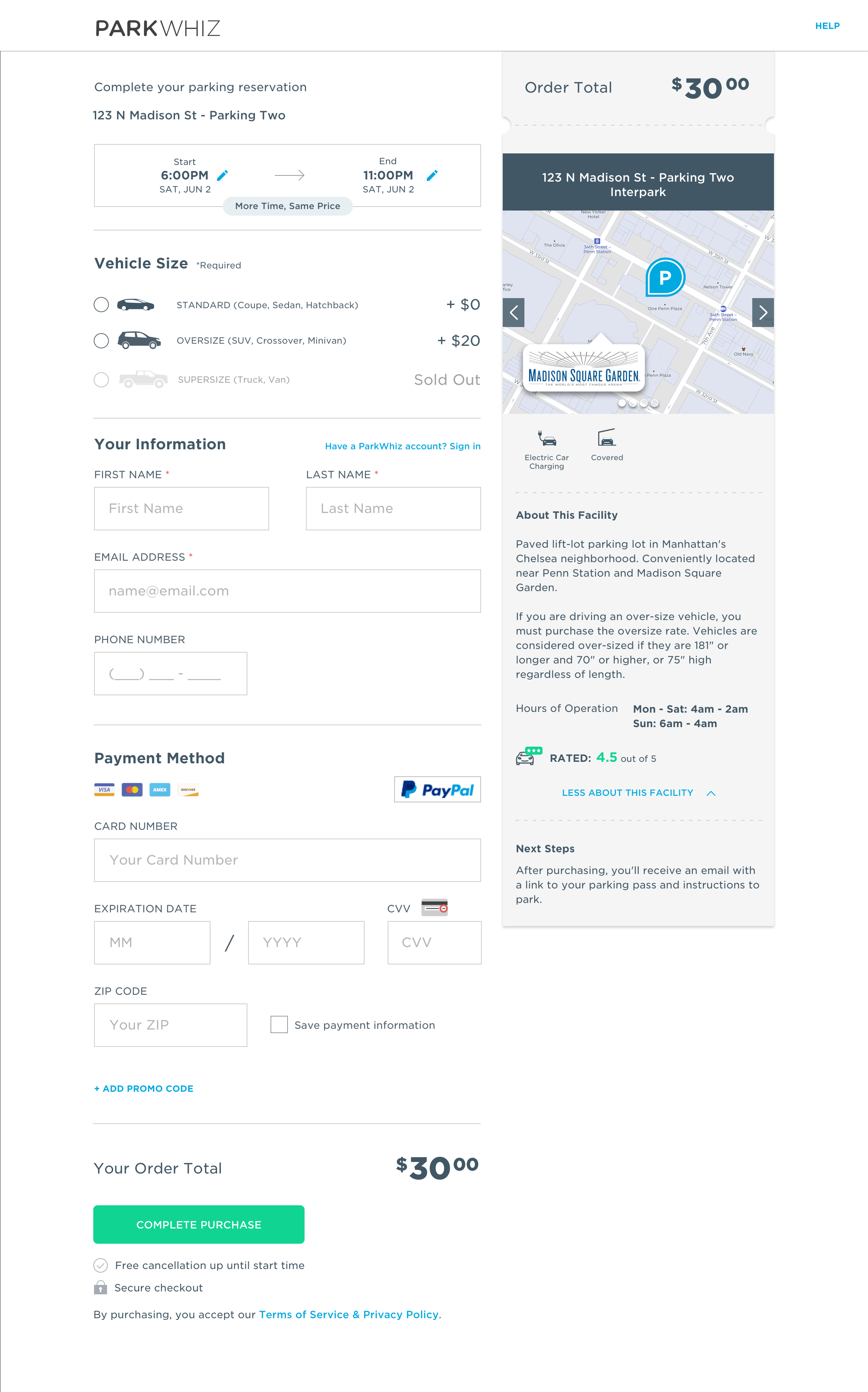
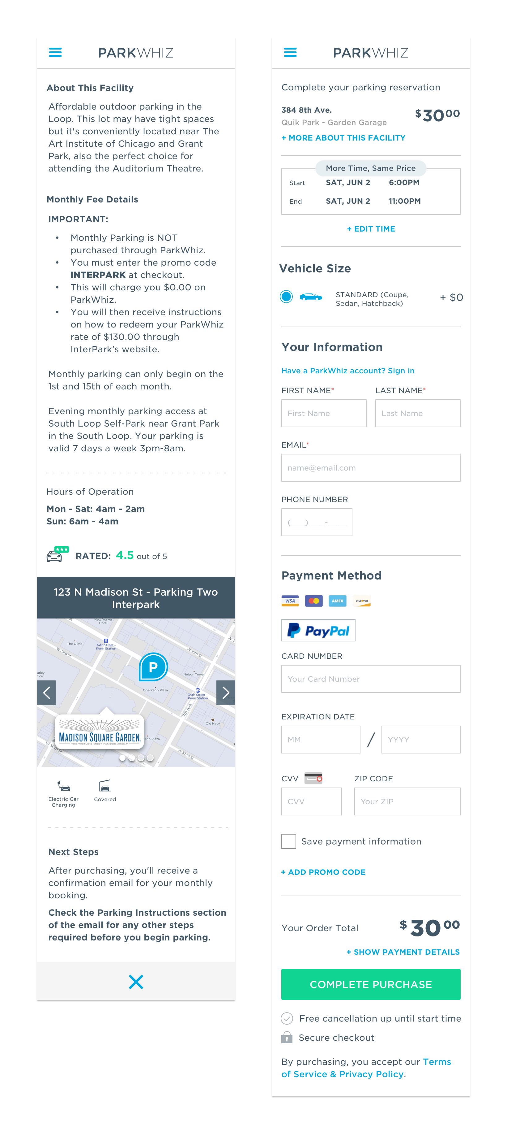
The right rail of the checkout page is a very prominent part of the the checkout process. Although there is minimal interaction happening in the content of this part of the page, there are small changes that will provide extremely useful and easy to find information for the user. The order total placement has not changed, and is still the most important piece of information to the user regarding their parking. From there we provide the address - and when available - a mini map. The difference from the old version is that instead of a static image, we now provide the user with a carousel that can show them the location on a map, as well as several images of the facility. Below the photos and amenities, there is now a section that provides more information about the facility including a preview of the garage details with the ability to view hours of operation, along with any other important location information.
Another way to improve conversion is to remove any elements of distraction. Starting with the simplifying the header to just the logo and a help button, we can direct the users eye to the important pieces of information on the page. Towards the bottom of the page we also have the promo code field that is now hidden, and expandable upon a text link. Research shows that promotional fields encourage users to leave a checkout page to find coupons off-site. By making the promo code a more subtle text link, we significantly decrease the chances of a customer not returning to complete their purchase. The most drastic update that can be seen from the old checkout version to the new one are the visual interface updates. By removing the left-rail icons next to each section, we can make the most of the spacing between the input fields and provide a cleaner and simpler form process to make sure the user doesn’t get distracted while inputting important information.
A checkout page is extremely vital to a business. In this update, the focus was placed on the visual and architectural structure of the checkout page to improve the user experience, purchase awareness, encourage user trust, and increase overall conversions for customers coming from partner links and widget flows.