 Skype Interactive Web SDK
research, ux/ui design, prototype
sketch, invision, zeplin
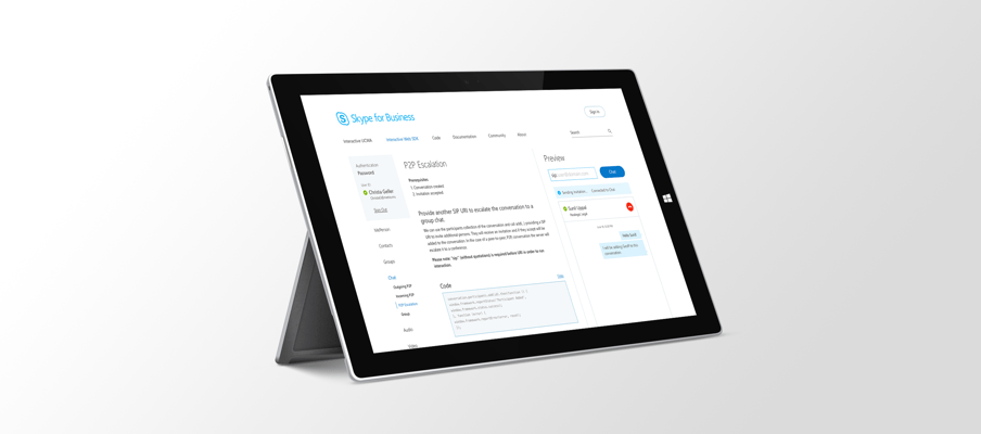
The Skype Web SDK is an online tool used by developers to integrate Skype for Business into their own platforms, or simply to test and discover how the product works. When this product was created, the developers went live with a product that was made by them. The result was a tool that possibly confusing, and not very intuitive, which also lacked any Skype branding.
Design an interface that is intuitive for developers no matter what level they are (beginner to pro) and integrate Skype branding.
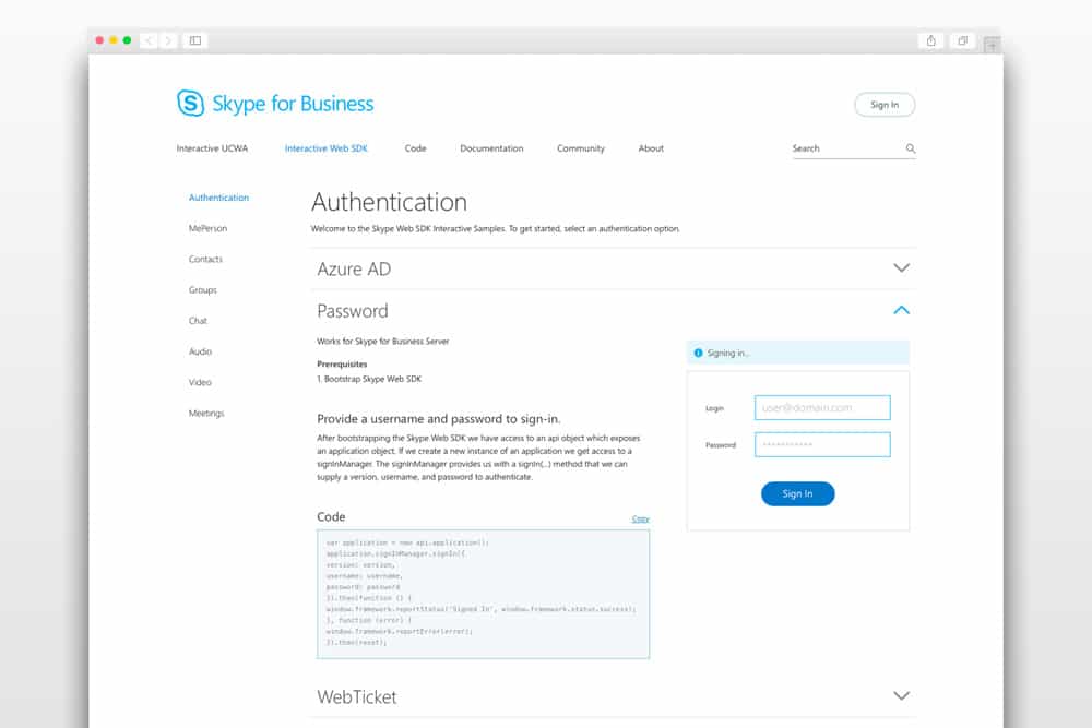
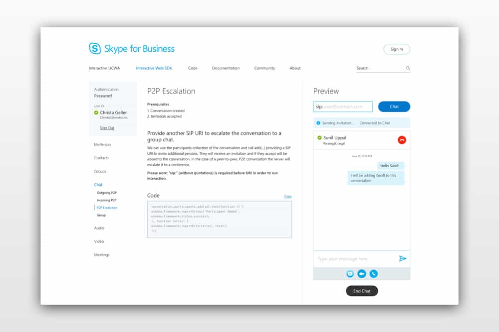
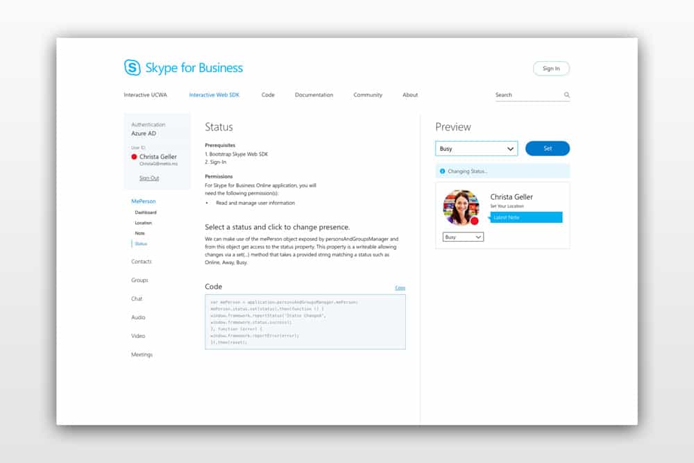
Since one of the biggest issues in the interface was understanding the how the product worked, the most noticeable part of this redesign was the creation of a proper navigation.
As a designer, this project was particularly challenging. The first part of this project was spent really understanding and interacting with the platform to understand how each section worked. From the research and working closely with the development team, I was able to create a navigation that led the user through the flow and make a more intuitive interface. One big aspect of this project included creating a typographical hierarchy which helped separate content sections from each other. Another big redesign in this layout was to keep all of the preview interactions in a newly added right column. Having this column kept the interactions consistent and helped the user predict where to look for changes in the testing or coding sections. The final deliverables for this project was the visual designs along with a Zeplin file for the developers to pull all the assets and front end code needed to build this product.


