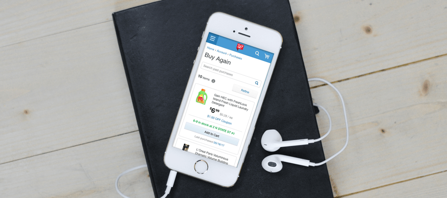
 Buy Again
research, ui design, prototype
sketch, sketch measure, invision
The Reorder Products page in the account section of Walgreens.com is an underutilized feature that was launched without going through a proper research and design process. There is very little-to-no awareness of this feature, and from a business perspective can be an effective tool for repeat purchases.
Improve the current Reorder Page by increasing customers’ awareness of the products they have purchased in the past.
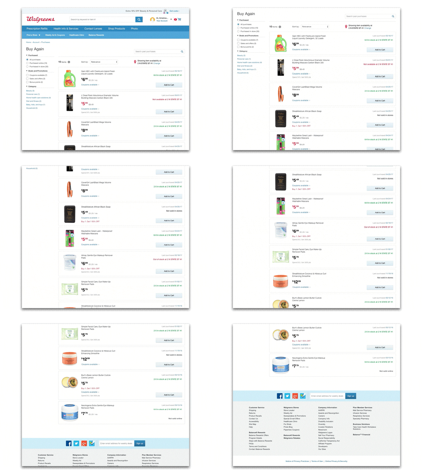
Buy Again (formerly Reorder Products) is a product that was created to allow customers to browse through products they have previously purchased online and in-stores. This iteration of the product was designed to provide an easily digestible browse page to help customers find the products they’re looking for, know what savings and deals are associated with those products, and personalize their data to show them their most frequently purchased items first.
My initial research involved different types of shopping lists from a variety of online retailers. This research included sketching wireframes and determining which features paired well with the Walgreens brand and project goals. I worked closely with the UX designer on my team to determine what information would be useful to show on the product cards, and identify what other areas of the site this product would affect. Based on the nature of our product grids, I designed comps with a list view to differentiate personalized lists from general product lists on Walgreens.com. My comps included designs for desktop, tablet, and mobile, showing the different breakpoints of each device size. Through this process I also worked closely with the copywriter on my team to ensure that the tone and experience of the user flow matched our project goals.

