 Credit Union Match Web Survey
research, wireframing, design, illustration, css prototype
sketch, illustrator, webflow
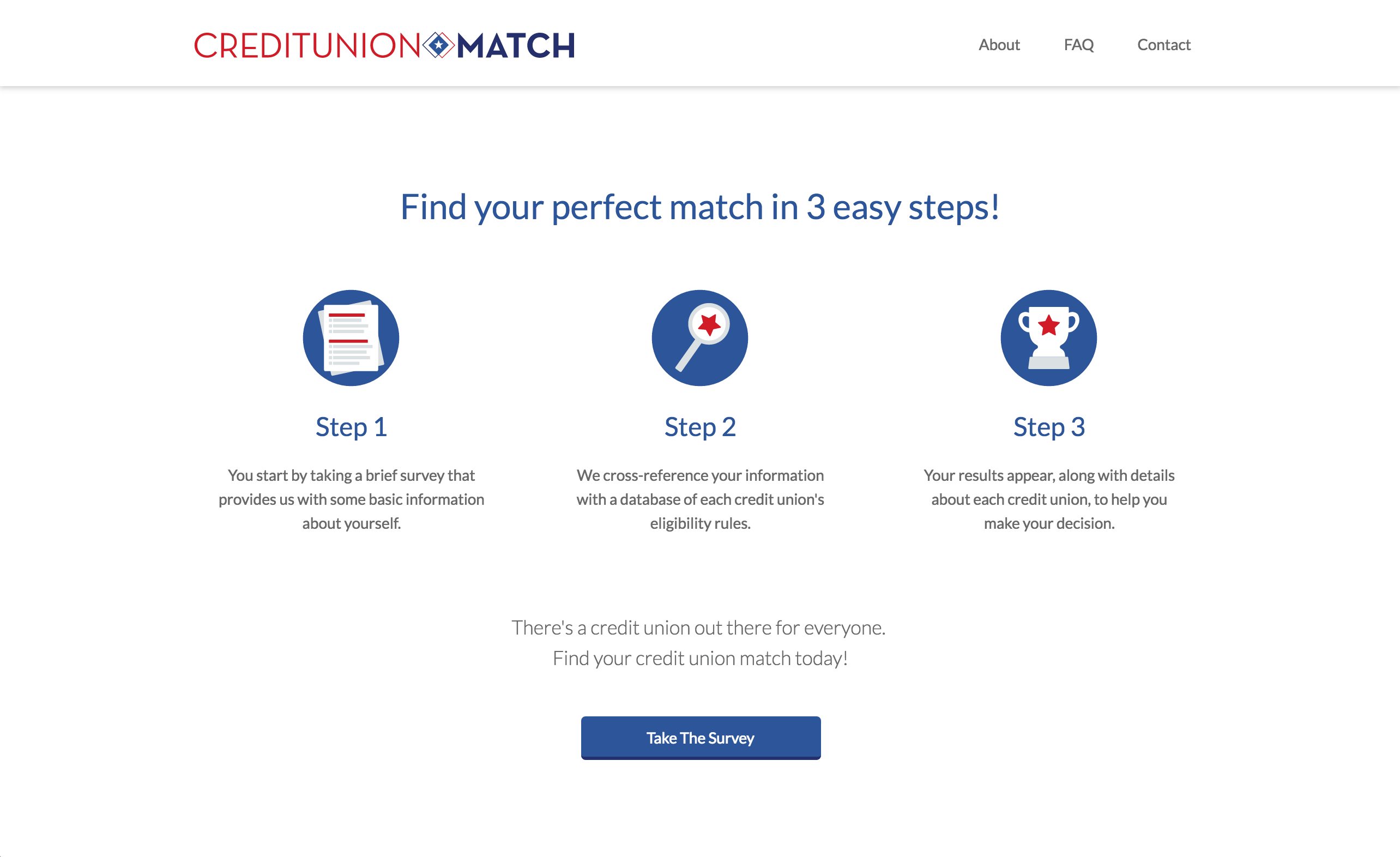
CUCollaborate wanted to launch a web survey to help potential clients find credit unions that they’re eligible to join. CUCollaborate had their own internal developer, but needed a designer to think through the user experience and flow, in order to provide the best product for credit unions and their customers.
Create a web survey that takes users through the appropriate question flow to find the credit unions that best fit their needs. On the business end, this survey needed to be created as a white-label product, so invested credit unions would be able to use this service and change it to match their brands.
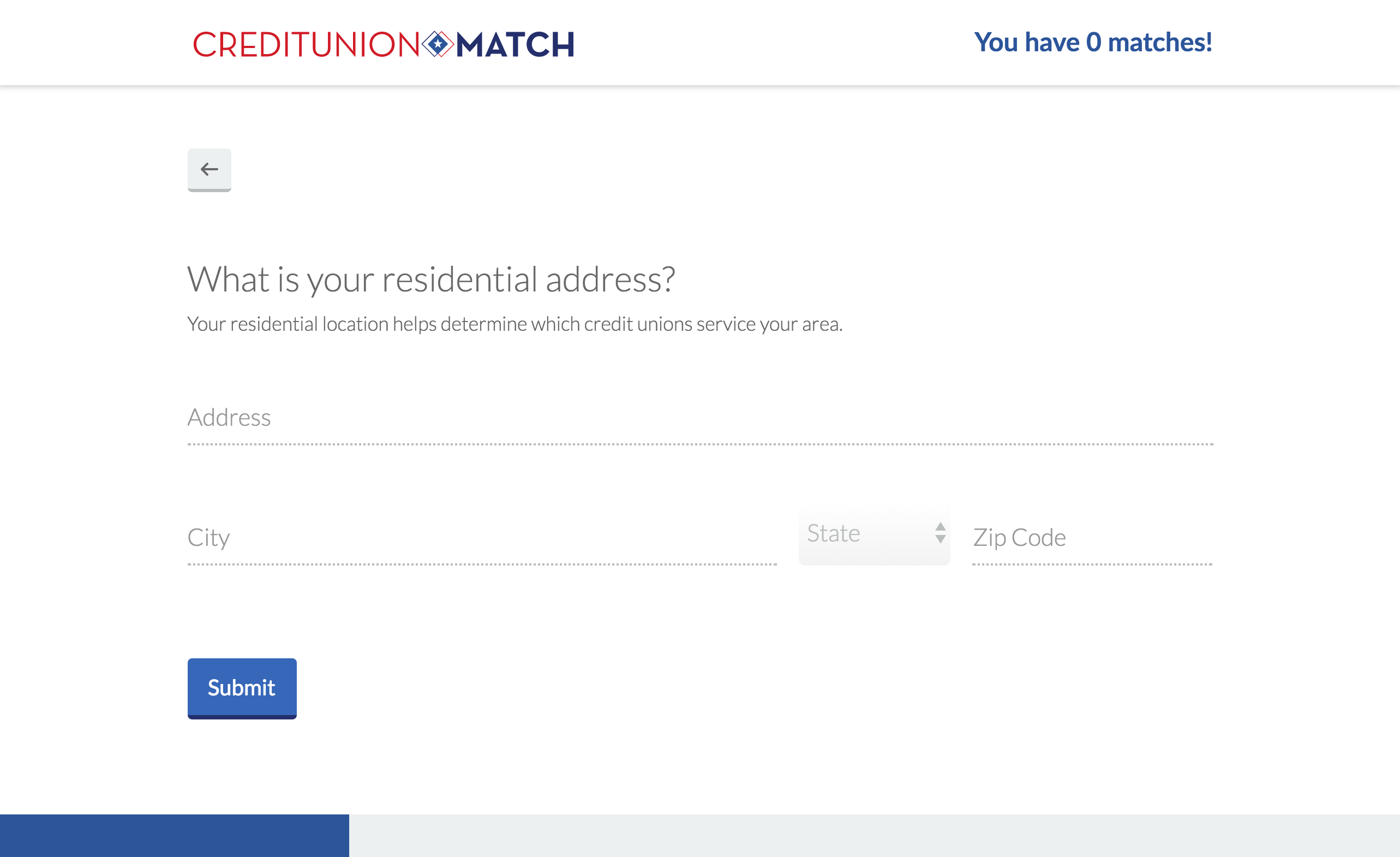
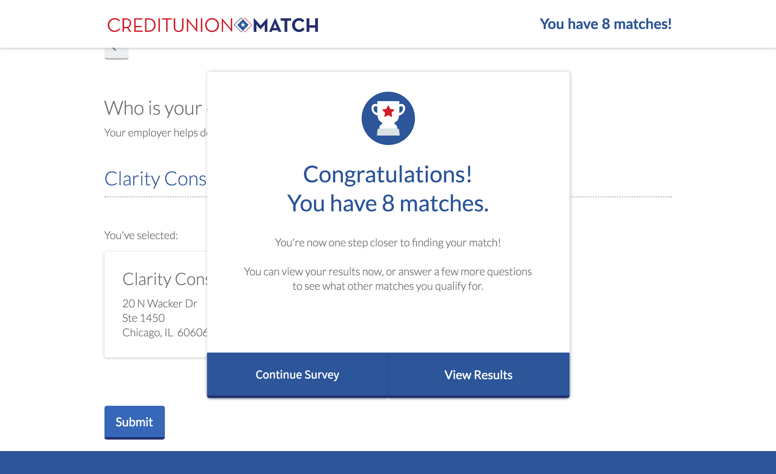
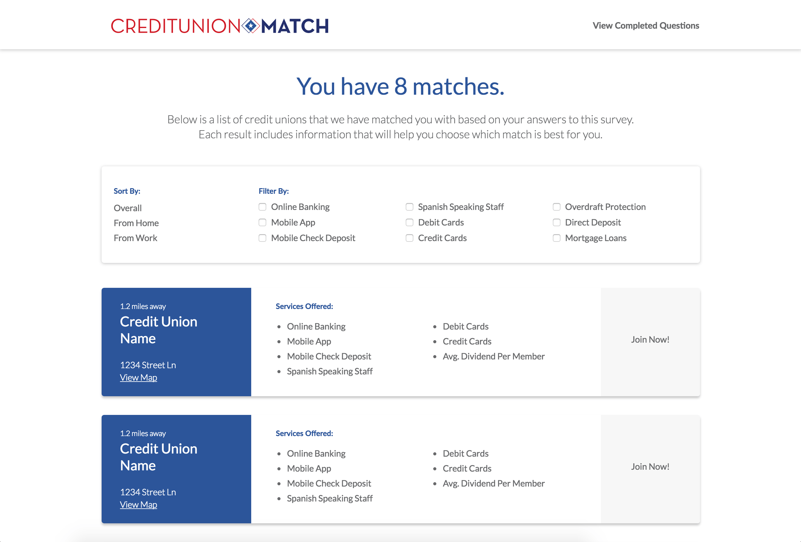
This project had a “choose your own adventure” theme, and it allowed users to answer as few as three questions to find a result. In order to make the survey seem less daunting, I display a progress bar through the initial three questions, which are required for a result, as well as a questionnaire menu that allows the user to answer questions in any order they choose.
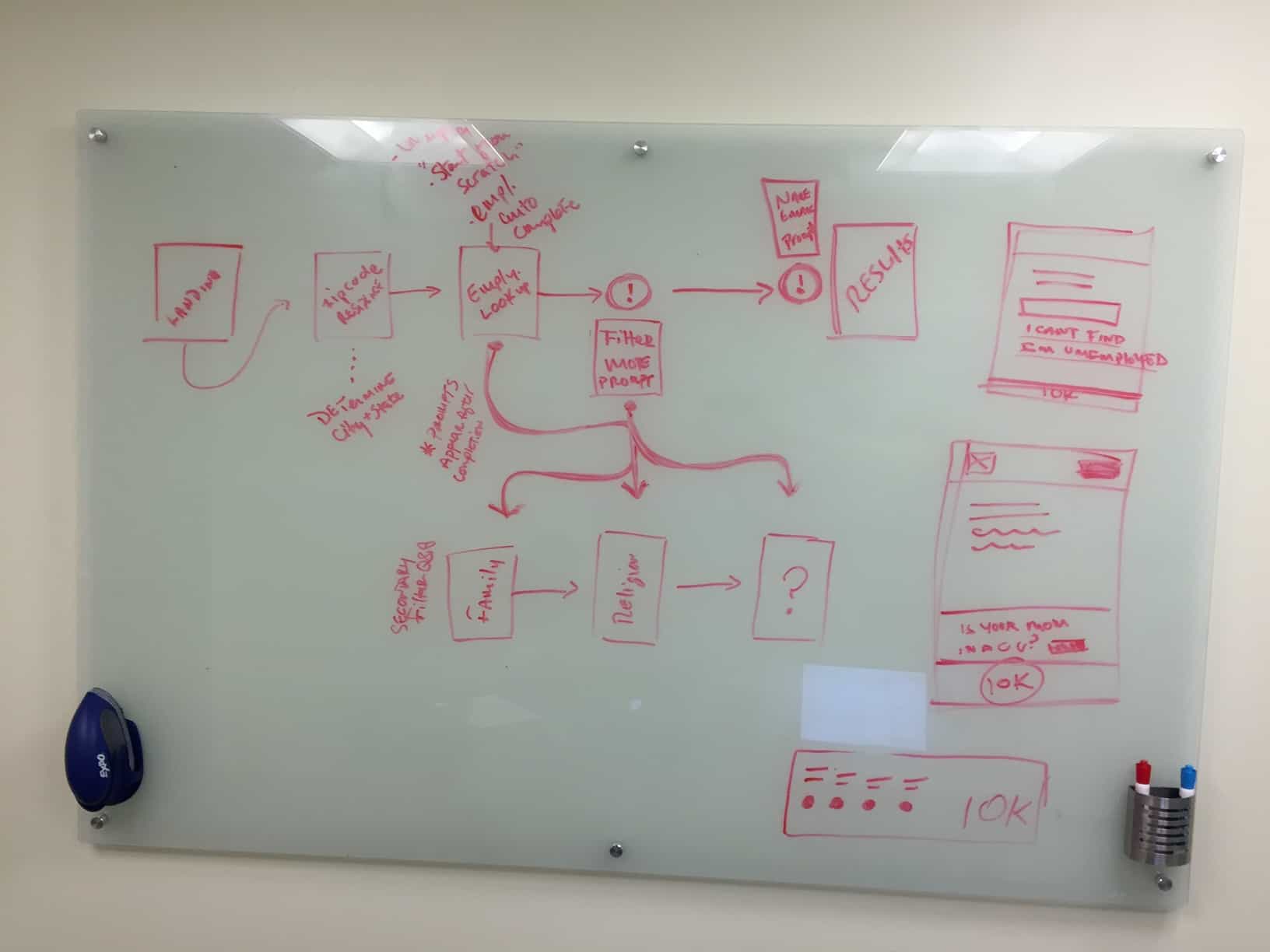
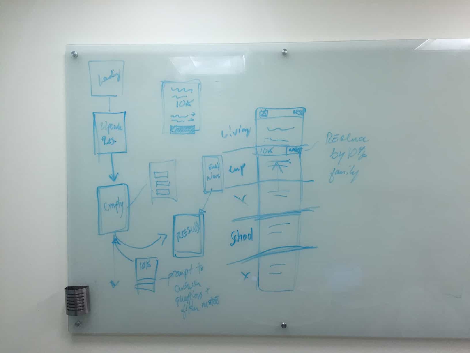
This project started with research in the credit union industry, as well as different styles of web surveys that exist today. We finalized the “choose your own adventure theme” in a rapid ideation session, which led to whiteboarding, wireframing, and finally visual design. There was a lot of time spent determining the best user flow to make this process work seamlessly and provide an experience that was self-guided. I created illustrations to add subtle visual cues and make add a bit of life to the interactions in the survey. The CSS prototype I handed off to the CUCollaborate developer was build with a web design tool called WebFlow. Because of the interactions and transition animations in the prototype, I also had to solve an issue in Javascript before passing off the files to the developer. The survey can be found at http://creditunionmatch.com.
