 Facebook Safety Center
mobile ui design, animation
sketch, after effects, invision
The Facebook Safety Center was going through a redesign of all its content, and needed the page designs to match.
Provide an engaging experience of the Facebook Safety Center that included all the extensive information provided by the Facebook Safety team.
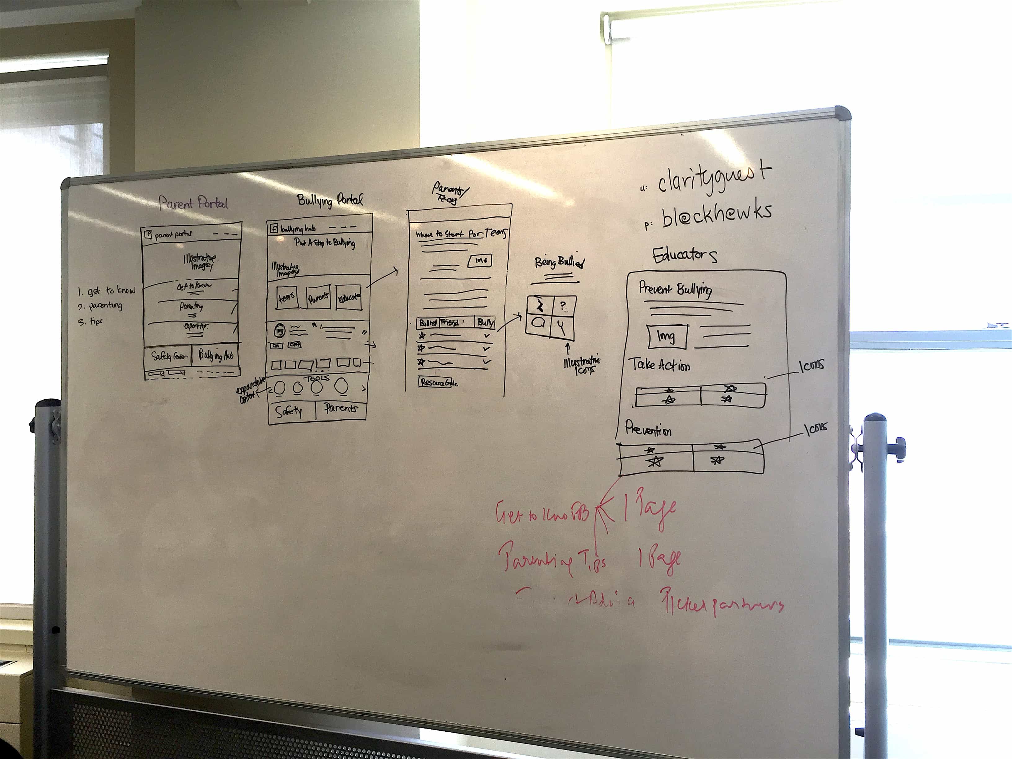
This project was split between myself and another designer on my team. Since I have a bit of experience with animation, I was tasked to work on the design for the mobile pages as well as simple animations in the headers and footers, while she was in charge of the desktop and tablet designs.
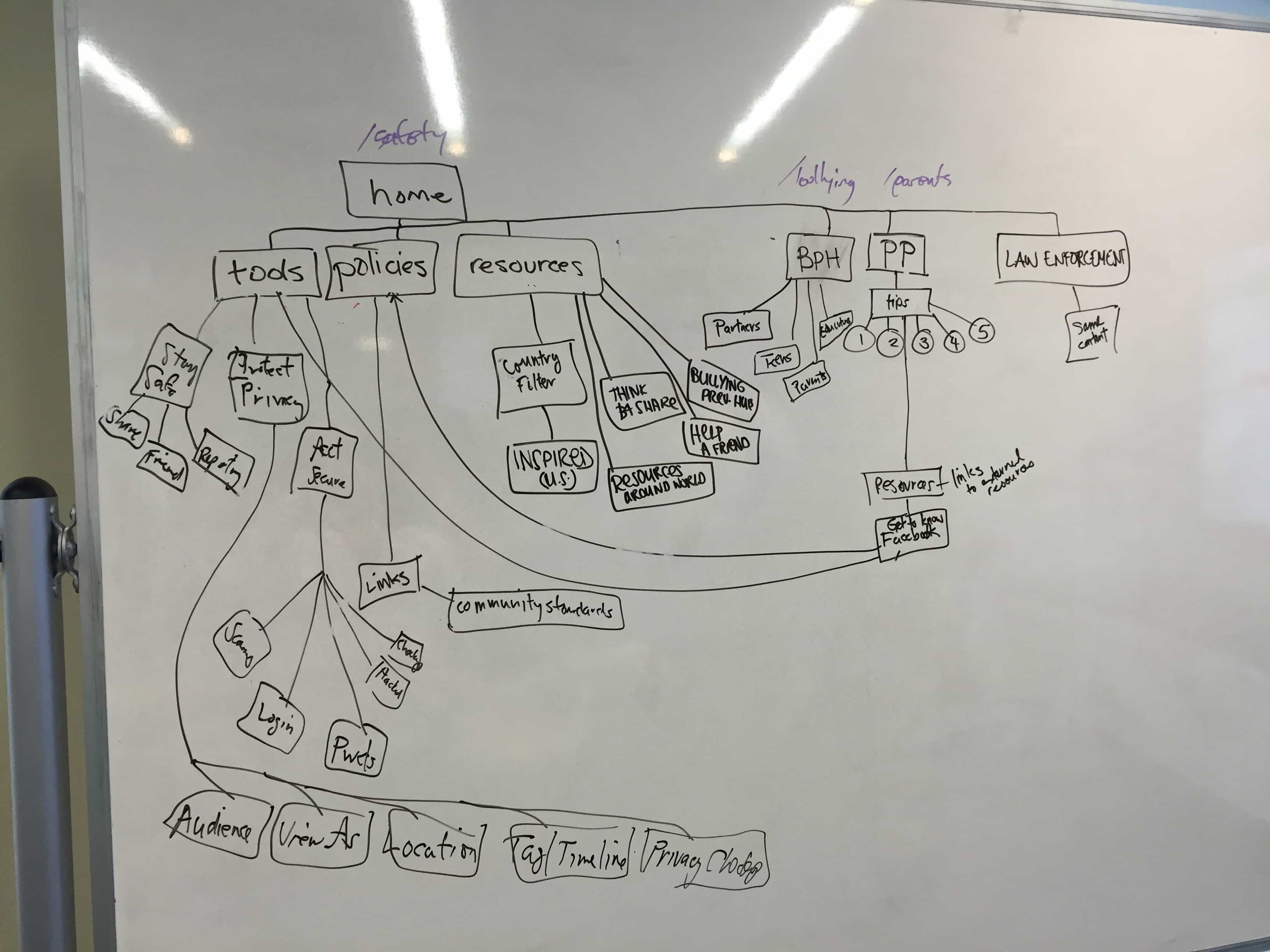
We started with a kickoff meeting with the project stakeholders, talking through all the different aspects of content needed in each of the pages. As this project was very content heavy, the solution had to make it easy for readers to search through and find the information they were looking for. Facebook provided us with illustrations to integrate throughout the layout which helped breakup our designs and avoid pages from appearing too content-heavy. After the the main parts of the mobile designs were completed, I started working simultaneously on the header and footer animations. Since these were to be subtle motions meant to provide a fun and playful tone in otherwise serious content, I focused on creating slight movements that looped. The end result for this project were Zeplin files passed over to our in-house developer for the pages, and gifs for the headers and footers.


