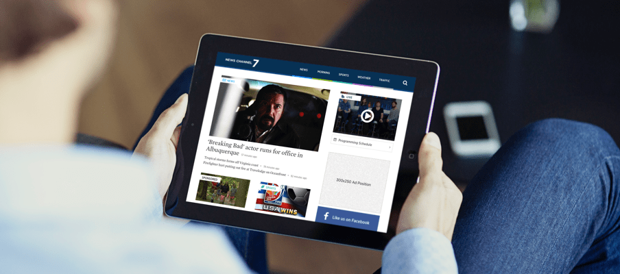
 Local News Site Redesign
research, ux/ui design, prototype
sketch, invision
There is a lot of social media interaction with local news articles, but as a result their home pages are losing traffic. Additionally, there are noticeable drops in traffic and share rates during weekends. Tribune Media wanted to experiment with a different approach to their layout to track the impact it would have with engagement on their site.
To get users to return to the site more often while lowering the bounce rates, establishing the news brand, and incorporating ad space.
Redesigning the local news site would help strengthen the brand and create an easier social media integration that keeps readers on the site longer. On a site that creates 20-40 new pieces of content a day, readers want to know that they can trust this news source, and that by coming to its home page they’ll be able to find the type of news they’re looking for quickly and with ease.
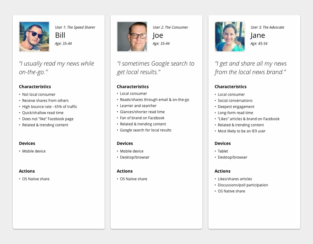
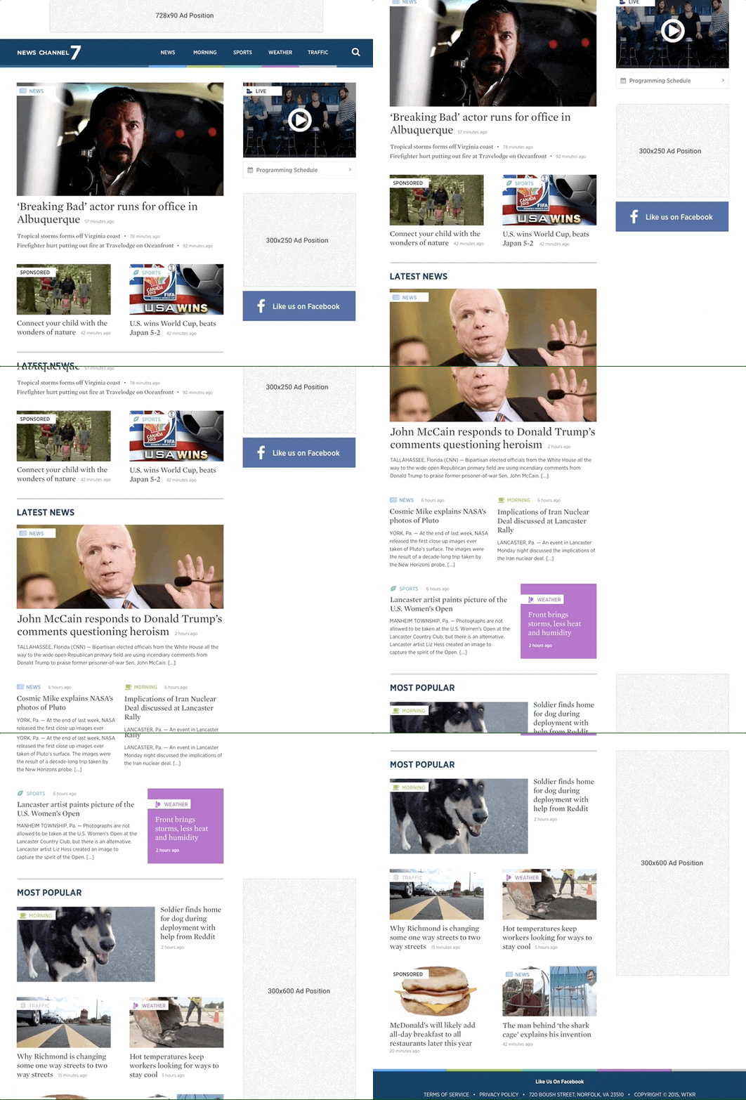
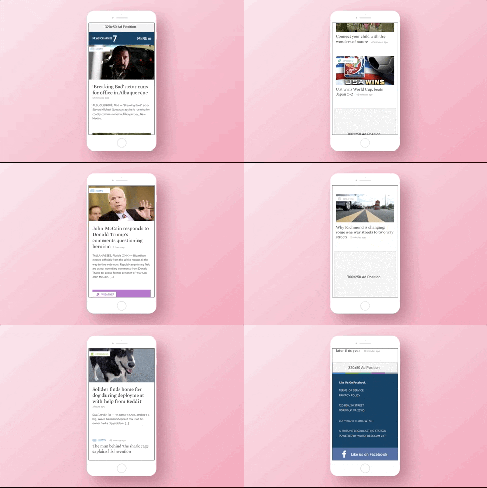
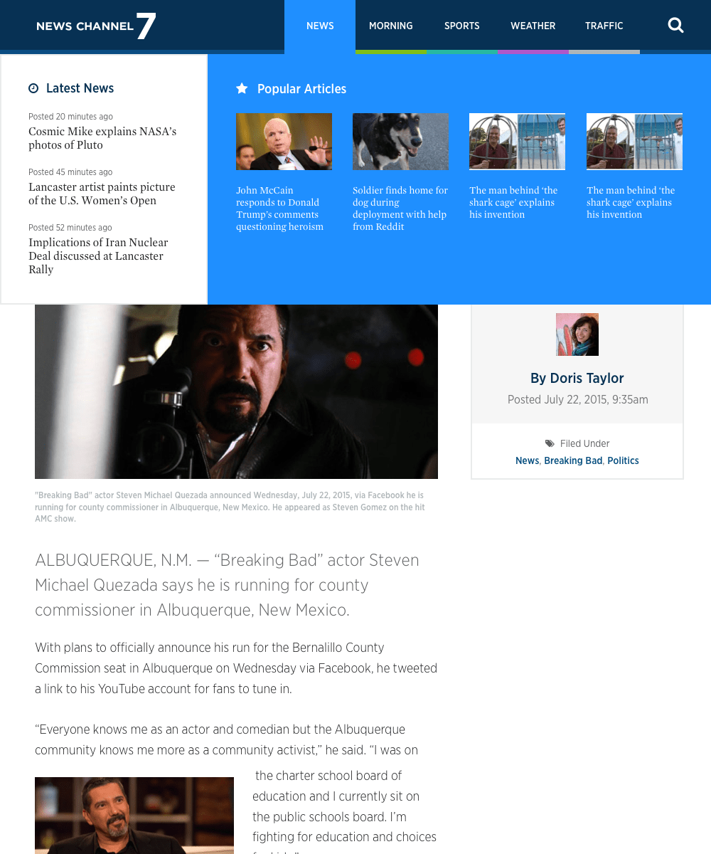
The process began with researching trends in media and news sites. From there we created three personas based on the user and business goals. Using the three personas, we were able to make decisions on how articles were presented and come up with a different approach to the content-heavy menu bar. Some of the features that were added to the site included an article progress bar, accent colors for each of the different sections of news, and reference comps for last noted feature to promote continuous reading and social media sharing. The deliverables for this project included the details of our personas, wireframes, design comps, and an InVision prototype. After the design portion was complete, we worked closely with our in-house developer to build the site.
